You are here: GSI Wiki>Tasca Web>TascaControls>UTCSP>TcsSwReqSpec>TCSHowToShowInfo (2012-06-22, JonPetterOmtvedt)
TASCA Control System - How to Display and Provide Information
New section added by JPO on 20th June 2012! Return to Control System main document. The front end of the Control System, GUI, should be divided (JPO proposal) in two separate parts:- Pure display(s) of information - the "Information Panel"
- Work and control terminal - the "Control System"
The Information Panel
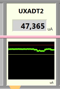
It seems that the current GUI of the Beam Control & Safety VI is working fairly well for most people. I (JPO) suggest that we use the upper part of this as basis for the Information Panal, but that it's enlargeg do make it easier to read from a distance. Of course, all control functions should be removed. The functions of the FPGA fast monitoring should be added to make a complete overview in a single window. I have made a VI which shows how this this could be implented. There are some pictures at the bottom of this page. The VI has a simulation sub-VI allowing you to play with the parameters. Anyone who would like a copy please ask - it's not quite completed, so I have not uploaded it yet. When the Shared Variable Server(s) are up and running, the VI should be quite easy to hook up to the real parameters - just rewrite the simulation Sub-VI. I (JPO) suggest that we do not use "VU" meter-style indicators. They use a lot of space and gives trend information. For parameters which is central and critical, the small chart type graphs (without scales) should be used. Alarm tresholds should be displayed in these charts (example at bottom of page). If we do not need trending, we can use normal number display, preferentially with fixed units and magnitude order. I.e. a practically zero integral should not read like 4.567E-14, but 0.004 x10⁻¹⁷. By keeping the magnitude order fixed it is quicker to understand what the number really tells you.| Examples of display elements | |
 Fig. 1: Chart style for trending. Yellow line is lower limit, read line upper limit and thick green line is parameter value. Fig. 1: Chart style for trending. Yellow line is lower limit, read line upper limit and thick green line is parameter value. |
Fig. 2 Something will come here... |
| kj | jk |
Discussion Topics
- How should we display the DT3 values from NODAL and DAQ - in principle they should be equal. Should we nevertheless display both? I suggest that we display the NODAL values as we currently do (value and strip chart), but that the values from DAQ is shown as a histgram of the pulse distribution. This should be generated by the FPGA host and provided as shared variable updated e.g. once per what? sec? min?
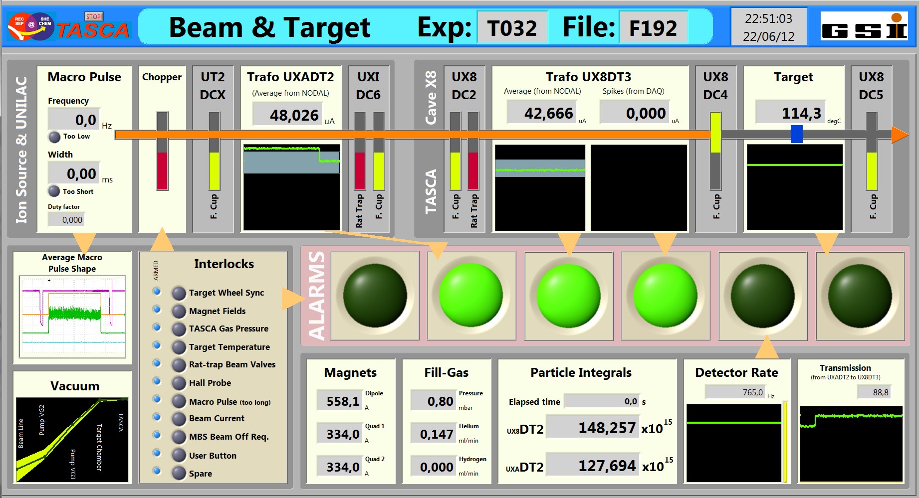
- Screen shot of new TCS Information VI, no interlocks but with DC4 in:

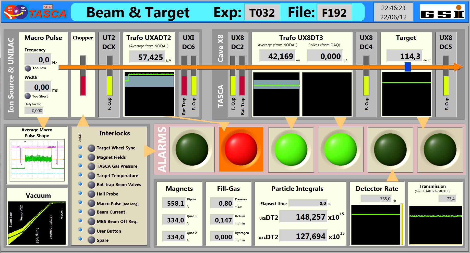
- Screen shot of new TCS Information VI. This is a non-real situation, as the TR2 is above the safety limit but the Interlock has not been triggered. Of course, this should not be possible when using real data in a real situastion:

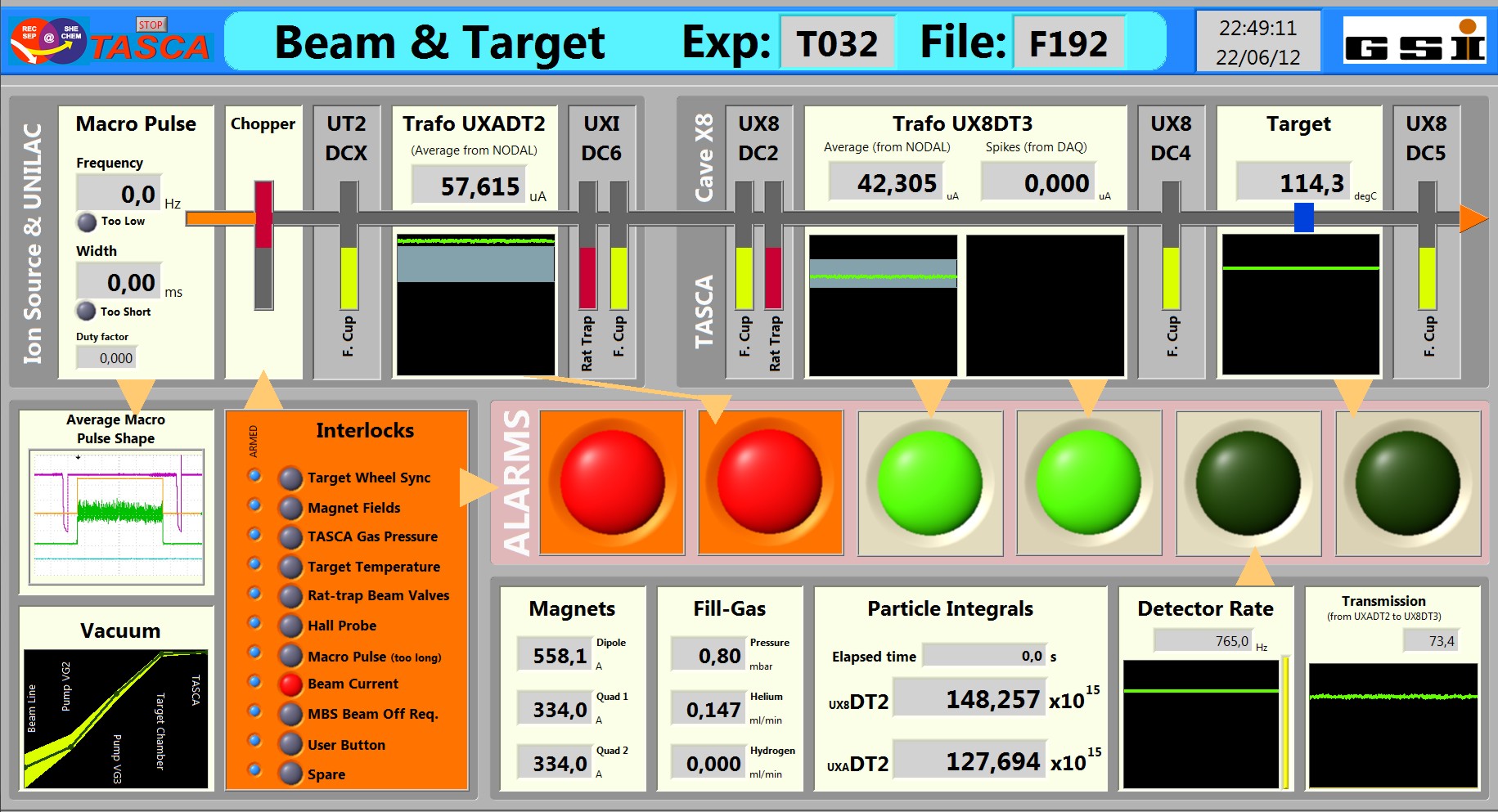
- Screen shot of new TCS Information VI: More realistic, TR2 safety has triggered an interlock. Notice that the parts where you should look for the error has been highlighted (and is blinking). This can be extended to include also the display with TR2 - a topic for discussion.

| I | Attachment | Action | Size | Date | Who | Comment |
|---|---|---|---|---|---|---|
| |
InformationVI_pic1.jpg | manage | 404 K | 2012-06-22 - 23:02 | UnknownUser | Screen shot of new information VI |
| |
InformationVI_pic2.jpg | manage | 392 K | 2012-06-22 - 23:02 | UnknownUser | Screen shot of new information VI |
| |
InformationVI_pic3.jpg | manage | 403 K | 2012-06-22 - 23:02 | UnknownUser | Screen shot of new information VI |
Please login to edit this topic
Topic revision: r5 - 2012-06-22, JonPetterOmtvedt
- User Reference
- BeginnersStartHere
- EditingShorthand
- Macros
- MacrosQuickReference
- FormattedSearch
- QuerySearch
- DocumentGraphics
- SkinBrowser
- InstalledPlugins
- Admin Maintenance
- Reference Manual
- AdminToolsCategory
- InterWikis
- ManagingWebs
- SiteTools
- DefaultPreferences
- WebPreferences
- Categories
 Copyright © by the contributing authors. All material on this collaboration platform is the property of the contributing authors.
 Ideas, requests, problems regarding GSI Wiki? Send feedback | Legal notice | Privacy Policy (german)


